|
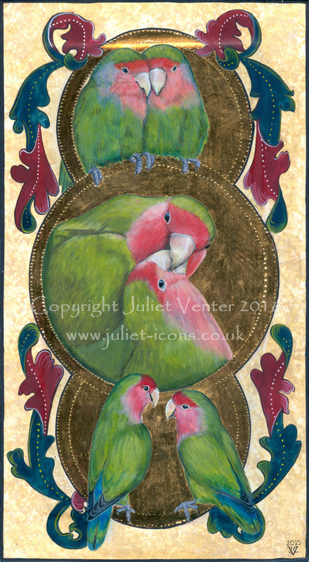
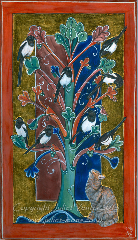
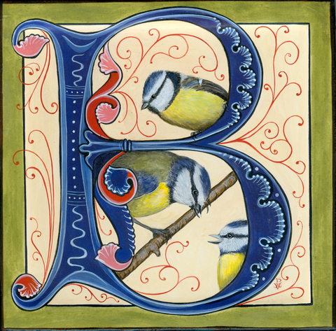
It is a typical damp and blowy English bank holiday Monday, so here are some imaginary birds to cheer the scene.
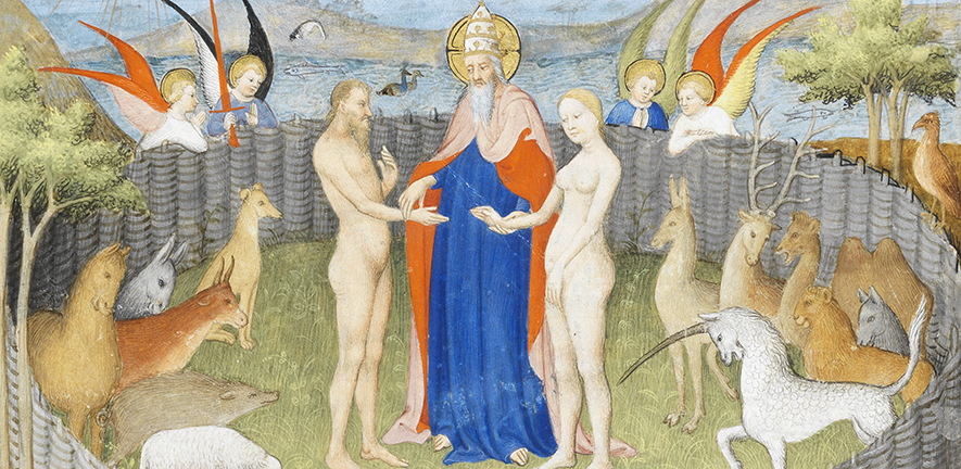 This is a not-to-be-missed opportunity to see illuminated treasures from many centuries and cultures at the Fitzwilliam Museum in Cambridge. Fortunately there is plenty of time, as the exhibition runs from 30 July to December this year. It is entitled Colour: the art and science of illuminated manuscripts, and is part of the university's manuscript research and cataloguing project that has been going on for some years now. Cambridge University as a whole has a magnificent collection of illuminated manuscripts scattered through the college and University libraries, but unless you are a senior university member or can offer bona fides from a serious academic institution elsewhere you are unlikely to get a chance to handle and really be intimate with any of the great treasures. Looking at them dimly lit behind glass is frankly not the same, but is still a wonderful opportunity for study, if only to realise how very tiny much of the work is. Reproductions in books tend to be very much enlarged, and one gets no sense of the absolutely diminutive scale these artists worked on. Either serious myopia was a job requirement and these artists were blind as moles more than six inches from their noses (as I am myself) or else magnifying eyewear was more common in the middle ages than is generally thought. Someone ought to make a study of the role of myopia in art - I'm convinced it must have played a part in Impressionism as well.
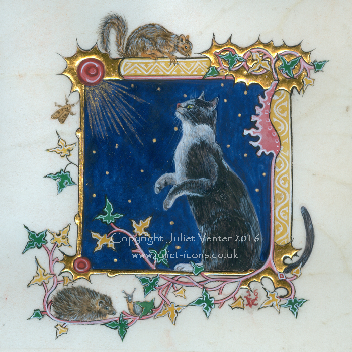
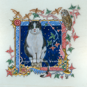
I'm not sure I made the right decision with my membership of the Society of Feline Artists. I love cats but the art-buying public seems not to, or at least not so much as they do birds - and one must be just a teeny weeny bit commercial. I had fun getting together my offering for this year's show at Llewellyn Alexander Gallery in London though: it's not till August but it's as well to get ahead. Just sorting out the framing is a mission in itself, especially for the vellum pieces. I am pleased how small I am managing to paint on the vellum. Not up to medieval standards of miniature yet, but getting there. My considerable myopia makes it possible to see in splendid magnification an inch from my nose, but nevertheless every time I see a manuscript illumination I am astonished again at how tiny the detail is. Were all those artists really that shortsighted or were magnifiers more widespread than we think? These daubs of mine are just over three inches square: much smaller and they might not be visible on a wall, I suppose. Ideal for minimalists and owners of the new 'bijoux' style of property!
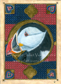 I did not, of course, study this beautiful puffin on the Isle of Muck, or the Hebrides or wherever outward bound types go for their holidays. My talented photographer friend Christopher did, however, and gave me permission to use his shots. He takes the most wonderful pictures of fauna and flora on his rambles and travels but doesn't have a website - track him down on Facebook and insist he starts one! Meanwhile this little piece awaits an owner at the Norton Way Gallery.
The Apocalypse Art Prize is an initiative started by an artist in the USA and a rare platform for traditional art: the idea is to create an original triptych illustrating three different parts of the Apocalypse of St John (Revelation), using traditional media and drawing on the principles (but not necessarily the styles) of medieval manuscript illumination. The prizes are sizeable and there is still time to enter (closing date 31 December 2015) - but read the rules carefully, they are quite specific. I have been working on an entry for a while but have found it hard, as the specified size is a good deal larger than my preference and the need for the work to be postable restricts the options a bit. Gesso boards, whilst much the easiest to work on, are far too heavy, and vellum at this size would be far too expensive for a speculative piece. That just leaves watercolour paper, which is a pretty horrid surface for egg tempera: you can't change your mind about the design or obliterate the smallest mistake, and even the best quality watercolour paper (Fabriano hot press 600gsm in this case) has a 'hairy' surface which is not rewarding to work on. I tried various ways of reducing the absorbency and fibrosity, including surface sizing with alum and with gelatine. In the end I used a trick which I read about from a bookbinder, who uses it on endpapers to simulate the appearance of parchment. You stain the paper first ( I sponged on a mixture of glair and ochre pigments) and then paint it both sides with bleached shellac. This makes it a little more translucent, like vellum, and makes a smoother, less absorbent surface for the paint. Not good enough to allow one to scrape off mistakes, alas, but good enough for try-outs and ephemera when you want to avoid expense.
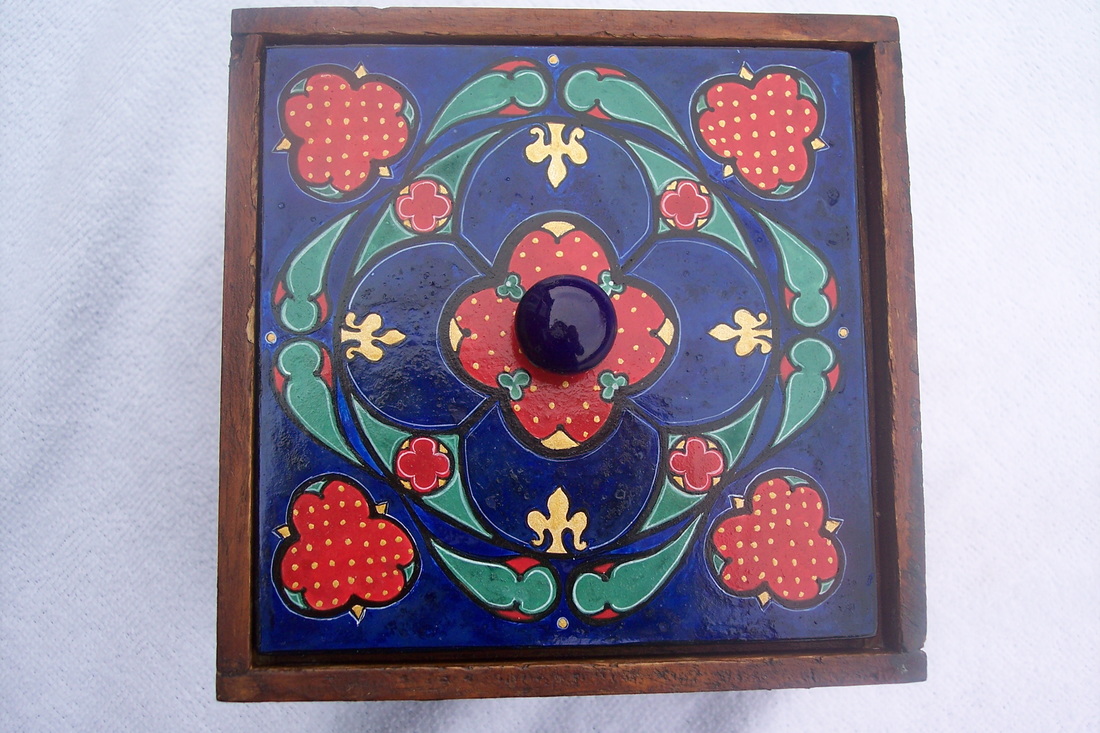
I guess we all tend to waste a lot of effort on half-resolved ideas and experiments which end up buried in sketchbooks or discarded on the back of scrap envelopes. Some while ago I went to a short workshop on natural geometry, and had a lot of fun with compass and ruler revisiting the only bits of maths O-level that really chimed with me (that and drawing nets). I tucked the notes in the cupboard and forgot all about it, until I broke the tile lid of a wooden box and decided to paint a gesso panel to replace it: an ideal opportunity to revisit the notes and do a little exercise in combining 'fourness' and 'threeness' in the manner of a medieval rose window. Jolly difficult too - not quite up to the standards of the cathedral architects yet, but at least the effort has not entirely gone to waste.
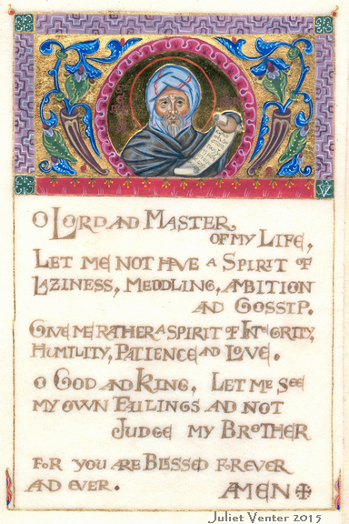 Illuminated prayer of St Ephraim the Syrian, on vellum 10 x 15 cm Illuminated prayer of St Ephraim the Syrian, on vellum 10 x 15 cm Today I finished an illuminated piece which I have been hanging fire on a long time, not knowing how I would manage the lettering. I've had several attempts at learning 'proper' calligraphy over the years, even with a tutor, which have mostly left me dishevelled, inky and frustrated. Finally I decided to use my mapping pen and work in my own adaptation of versals (inked in outlines): I swiped the design for these from the incomparable Klosterneuberg altar frontal by 12thC enamellist Nicholas of Verdun. Not perfect - I can just hear that calligraphy tutor now - but legible at least. The painted design is another homage to 12thc Armenian illuminator T'oros Roslin. This prayer of St Ephraim the Syrian, called the Lenten Prayer in the Orthodox Liturgy, is a favourite of mine. The support is natural calfskin vellum: I have been practising on vellum for a while, it is a touchy material but very rewarding. I used walnut ink made from crystals imported from the US (good old Ebay), gold leaf (of course), and mineral pigments including lapis lazuli and volksonkoite. On balance this was a mistake as their crystalline texture makes it very difficult to achieve the smooth surface needed for accurate top painting. Our medieval forebears must have had minions to grind their pigments much finer than the finest available today. For the medallion icon I used raised and burnished gilding, which is not historically accurate to the style of the manuscript decoration (in Eastern manuscripts only flat gilding was used), but then I wasn't intending a reproduction.
|

The view from my deskCurrent work, places and events, art travel, and interesting snippets about Christian icons, medieval art, manuscript illumination, egg tempera,, gilding, technique and materials. Categories
All
Archives
January 2024
|


 RSS Feed